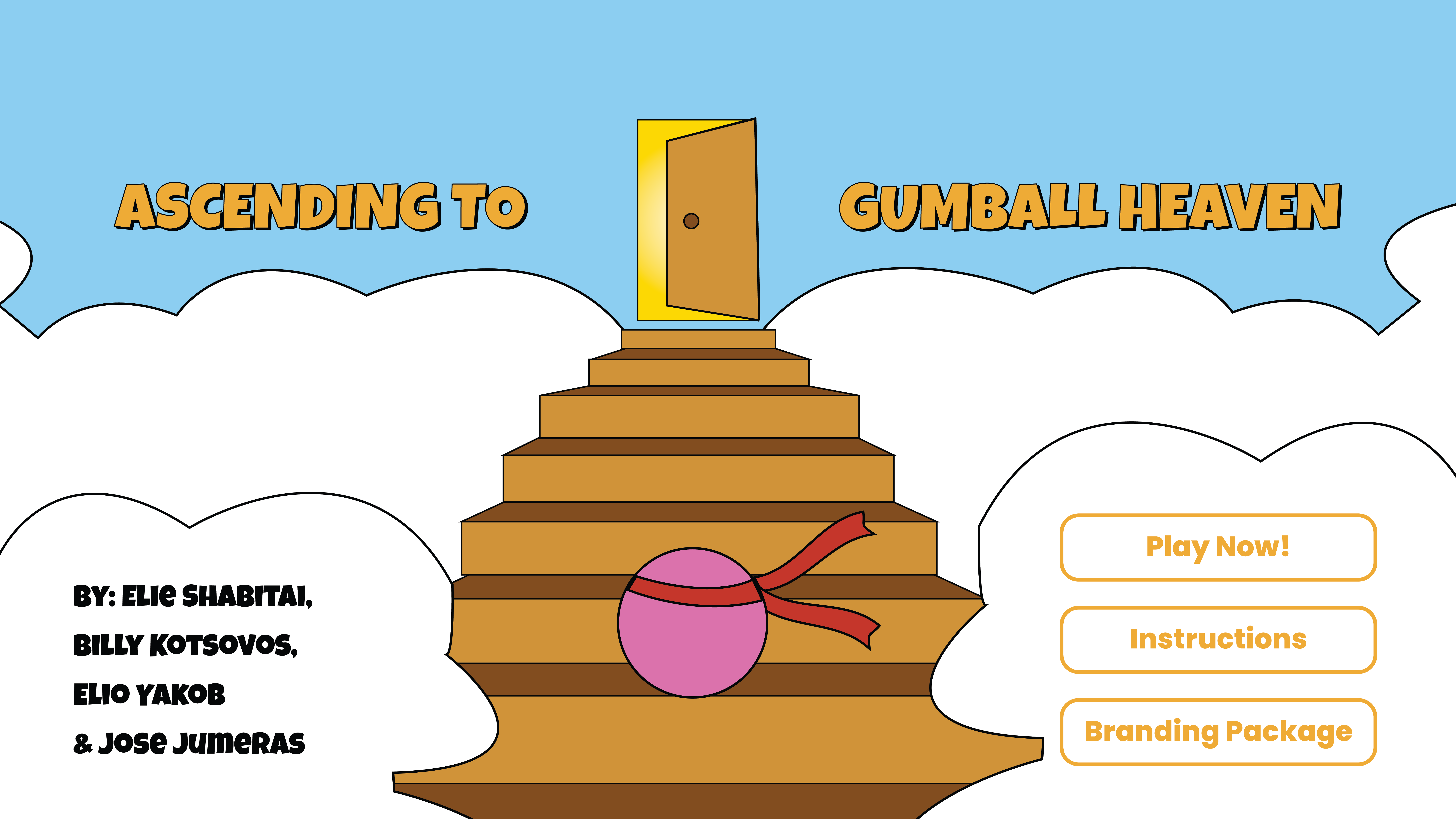
ASCENDING TO
GUMBALL HEAVEN
case study
Welcome to my case study, where I'll guide you through the development of a game design created as part of a group project in my animation class. Here, you'll gain insight into the design and idea process behind our game, observing the collaborative efforts of my team as we transformed our collective vision into reality.
Logo icon
THE GAME
"Ascending to Gumball Heaven" is a game where players take on the role of a brave little gumball navigating through a maze of falling obstacles to safely reach "Gumball Heaven," the final goal. There are different passage levels, with various sorts of obstacles appearing as the gumball progresses. Whenever the gumball gets hit, it slows down even more, making it increasingly challenging to move forward without being hit again and potentially eliminated. The controls used to avoid being hit are simply the arrow keys. This game is developed using HTML, CSS, JavaScript, and image/illustration designs.
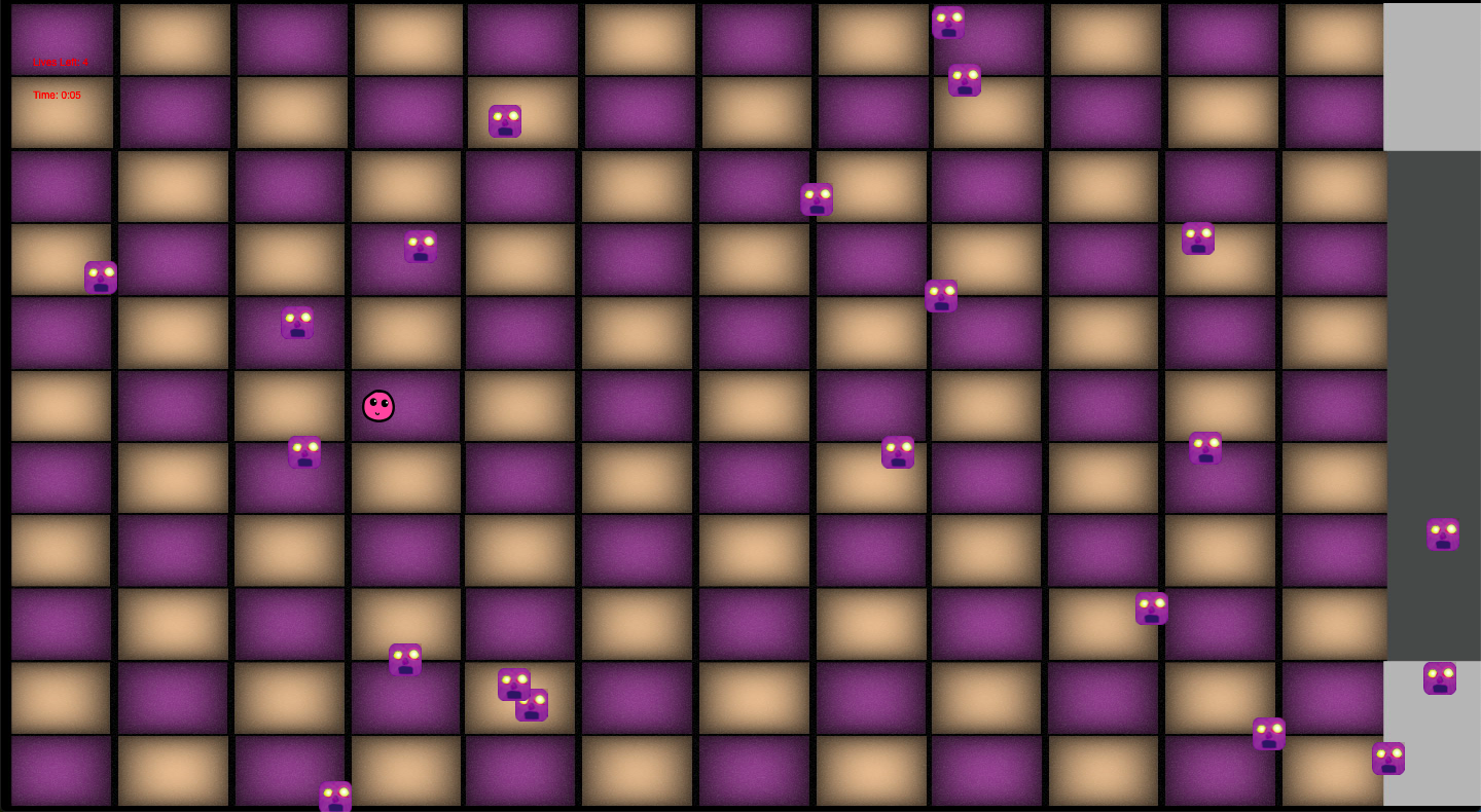
Screenshot of the Game
THE GOAL
The primary aim in creating "Ascending to Gumball Heaven" was to develop an entertaining and creative game that would capture people's interest through its design, encourage them to read about the game, and potentially try it out, sharing their insights. Additionally, it fostered a sense of teamwork, with each team member assigned different tasks, contributing to the collective effort of bringing diverse ideas together to create a game that would be effective for everyone.
My Role
My role in creating this game involved designing social media posts as well as the main game icon to promote the game across various dimensions. I utilized Adobe Illustrator to create all of these illustration designs, which can be viewed through the branding package. Additionally, I assisted my teammates in brainstorming the name, selecting fonts and colors, establishing the theme of the game, and contributed to a bit of coding.
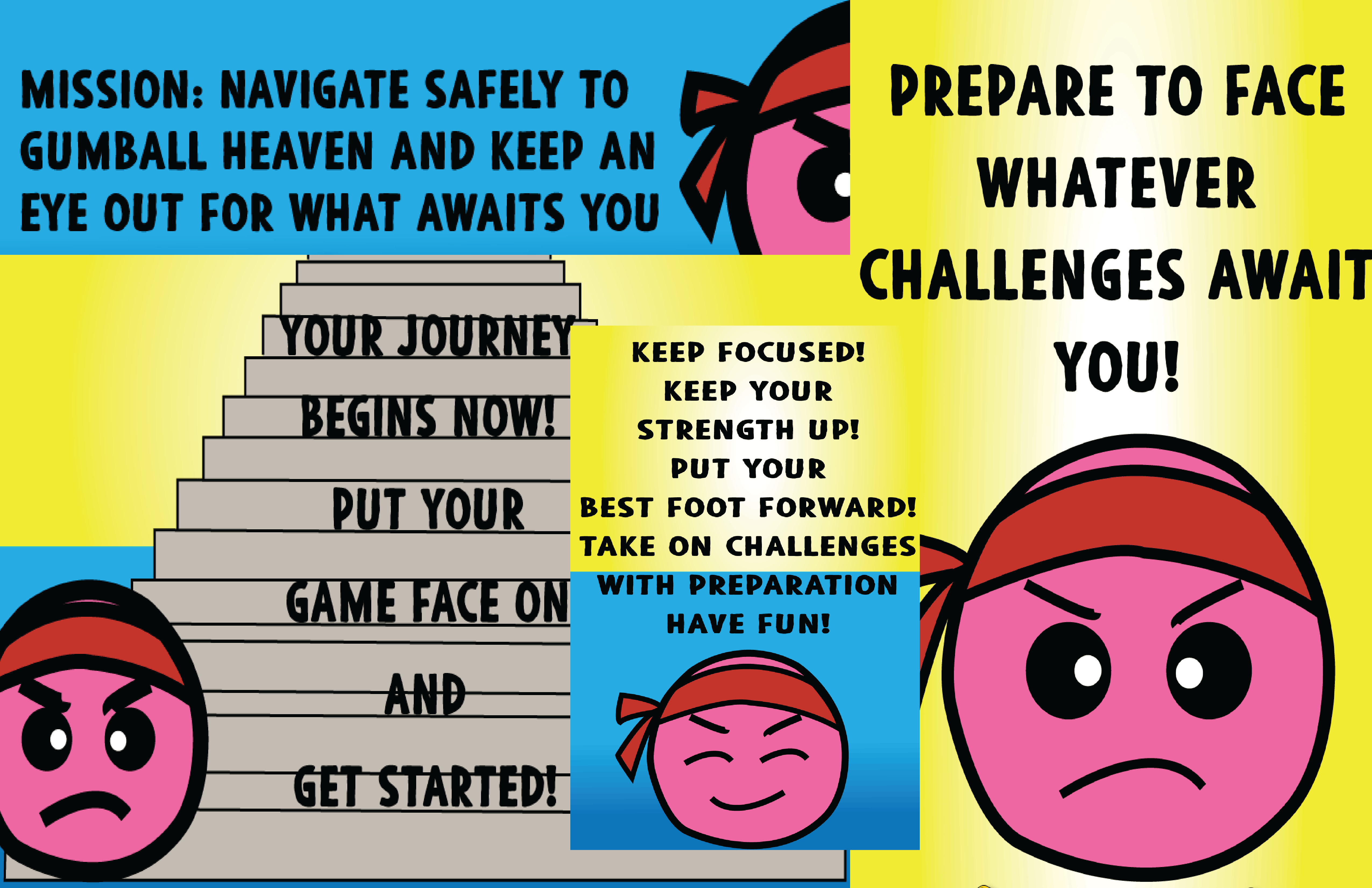
Social Media Posts
THE CHALLENGE
The main challenge was creating a fun and engaging concept for the game while ensuring efficiency and effectiveness. This involved brainstorming a theme, designing icons, assets, colors, and fonts that would harmonize seamlessly without being overly complicated. Each team member focused on their tasks and met deadlines to receive feedback from the teacher for improvements. Additionally, implementing smooth JavaScript coding was crucial to prevent errors and ensure seamless gameplay, requiring thorough testing to guarantee a trouble-free implementation process.
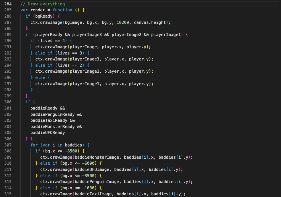
Javascript Game File
THE SOLUTION
To address these challenges, we initiated the process by conducting online research (Google Images & Printerest) for inspiration and creating rough sketches to jumpstart our creativity. As a team of four, we leveraged our collective creativity by openly sharing ideas until reaching a consensus. Each member was assigned a role tailored to their strengths, fostering efficiency and collaboration. Throughout the process, we provided feedback and support to one another, ensuring smooth progress and overcoming any obstacles encountered along the way. In my role, I often came prepared with ideas that I believed would align well with the concept of our game. I would present these ideas to my teammates, seeking their input and ensuring alignment with our vision. Ultimately, this approach led to agreements and propelled our project forward.

Inspiration Sources
THE PROCESS
The development process began with brainstorming sessions to generate The development process commenced with brainstorming theme ideas and concepts for the game, considering the target audience. We then proceeded to create rough sketches and wireframes to visualize the game's layout and mechanics. Once the initial designs were approved, we advanced to developing the game's assets, including the main character, obstacles, and background imagery.
Simultaneously, we collaborated on choosing a suitable name for the game. Following this, we delved into coding the game using HTML, CSS, and JavaScript to ensure smooth and responsive mechanics. Alongside coding, we curated a cohesive color scheme and selected fonts to create the landing page, instructions, and branding package section, integrating relevant images to enhance visual appeal.
Additionally, we incorporated the logo icon for the game to establish its brand identity. Throughout this phase, thorough testing and debugging were conducted to ensure the game's functionality and eliminate any issues. Upon finalizing the design and functionality, the game was prepared for launch.
Fonts
Luckiest Guy
ABCDEFGHIJKLMNOPQRSTUVWXYZ
abcdefghijklmnopqrstuvwxyz
1234567890
!@#$%^&*()
Poppins
ABCDEFGHIJKLMNOPQRSTUVWXYZ
abcdefghijklmnopqrstuvwxyz
1234567890
!@#$%^&*()
Blackore
ABCDEFGHIJKLMNOPQRSTUVWXYZ
1234567890!@#$%^&*()
Primary Colors
#EDAB36
#ffff
#DB72AB
#000000
#C4362A
#48ACE2
THE RESULT
My team and I were able to finish the game exactly as we anticipated. The game is fully functional, and I made sure to add consistent styling to the game font page and social media posts to ensure they align with the theme and convey the main message effectively. We switched roles to help one another as needed. Despite this being my first time, I learned a lot throughout the design process, gaining a deeper understanding of JavaScript, CSS, and HTML, which I found fascinating and enjoyable. Additionally, I acquired more knowledge of shortcuts and tricks with Illustrator, which I found both useful and fun. Overall, these new techniques proved to be invaluable, saving me time and enhancing professionalism across all my projects and assignments.
